
RxChart is a light weight Java library for plotting data utilizing reactive extensions.
RxChart is a light-weight and convenient library for plotting data designed to go from data to chart in the least amount of time possible and to take the guess-work out of customizing the chart style.
Create a XYChart instance via QuickChart, add a series of data to it, and either display it or save it as a bitmap.
double[] xData = new double[] { 0.0, 1.0, 2.0 };
double[] yData = new double[] { 2.0, 1.0, 0.0 };

// Create Chart
XYChart chart = QuickChart.getChart("Sample Chart", "X", "Y", "y(x)", xData, yData);

// Show it
new SwingWrapper(chart).displayChart();

// Save it
BitmapEncoder.saveBitmap(chart, "./Sample_Chart", BitmapFormat.PNG);

// or save it in high-res
BitmapEncoder.saveBitmapWithDPI(chart, "./Sample_Chart_300_DPI", BitmapFormat.PNG, 300);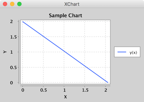
Create a XYChart via a XYChartBuilder, style chart, add a series to it, style series, and display chart.
// Create Chart
XYChart chart = new XYChartBuilder().width(600).height(500).title("Gaussian Blobs").xAxisTitle("X").yAxisTitle("Y").build();

// Customize Chart
chart.getStyler().setDefaultSeriesRenderStyle(XYSeriesRenderStyle.Scatter);
chart.getStyler().setChartTitleVisible(false);
chart.getStyler().setLegendPosition(LegendPosition.InsideSW);
chart.getStyler().setMarkerSize(16);

// Series
chart.addSeries("Gaussian Blob 1", getGaussian(1000, 1, 10), getGaussian(1000, 1, 10));
XYSeries series = chart.addSeries("Gaussian Blob 2", getGaussian(1000, 1, 10), getGaussian(1000, 0, 5));
series.setMarker(SeriesMarkers.DIAMOND);

new SwingWrapper(chart).displayChart();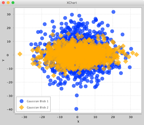
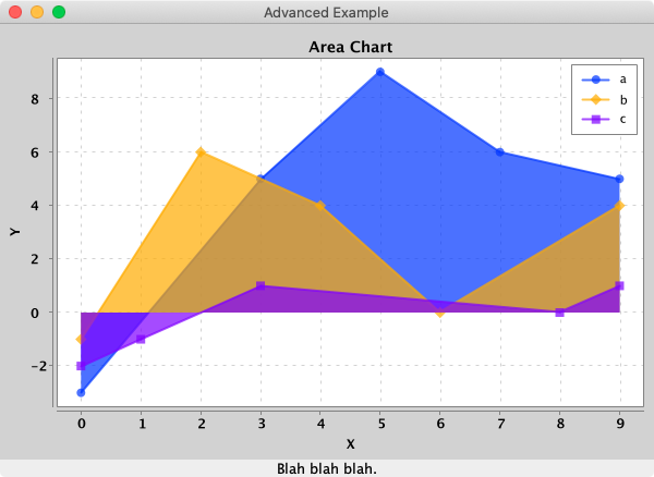
Create a XYChart via a XYChartBuilder, style chart, add a series to it, add chart to XChartPanel, embed in Java Swing App, and display GUI.
// Create Chart
final XYChart chart = new XYChartBuilder().width(600).height(400).title("Area Chart").xAxisTitle("X").yAxisTitle("Y").build();

// Customize Chart
chart.getStyler().setLegendPosition(LegendPosition.InsideNE);
chart.getStyler().setDefaultSeriesRenderStyle(XYSeriesRenderStyle.Area);

// Series
chart.addSeries("a", new double[] { 0, 3, 5, 7, 9 }, new double[] { -3, 5, 9, 6, 5 });
chart.addSeries("b", new double[] { 0, 2, 4, 6, 9 }, new double[] { -1, 6, 4, 0, 4 });
chart.addSeries("c", new double[] { 0, 1, 3, 8, 9 }, new double[] { -2, -1, 1, 0, 1 });

// Schedule a job for the event-dispatching thread:
// creating and showing this application's GUI.
javax.swing.SwingUtilities.invokeLater(new Runnable() {

  @Override
  public void run() {

    // Create and set up the window.
    JFrame frame = new JFrame("Advanced Example");
    frame.setLayout(new BorderLayout());
    frame.setDefaultCloseOperation(JFrame.EXIT_ON_CLOSE);

    // chart
    JPanel chartPanel = new XChartPanel<XYChart>(chart);
    frame.add(chartPanel, BorderLayout.CENTER);

    // label
    JLabel label = new JLabel("Blah blah blah.", SwingConstants.CENTER);
    frame.add(label, BorderLayout.SOUTH);

    // Display the window.
    frame.pack();
    frame.setVisible(true);
  }
});
To make it real-time, simply call updateXYSeries on the XYChart instance to update the series data, followed by revalidate() and repaint() on the XChartPanel instance to repaint.
- No required additional dependencies
- ~182KB Jar
- Multiple Y-Axis charts
- Line charts
- Step charts
- Scatter charts
- Area charts
- Step Area charts
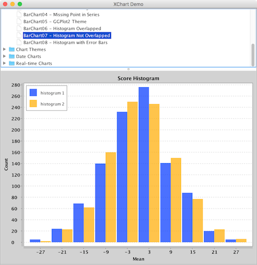
- Bar charts
- Histogram charts
- Pie charts
- Donut charts
- Bubble charts
- Stick charts
- Dial charts
- Radar charts
- OHLC charts
- Box Plot
- Error bars
- Logarithmic axes
- Number, Date, Bubble and Category X-Axis
- Multiple series
- Tool tips
- Extensive customization
- Themes - XChart, GGPlot2, Matlab
- Right-click, Save-As...
- User-defined axes range
- Definable legend placement
- CSV import and export
- High resolution chart export
- Export as PNG, JPG, BMP, GIF with custom DPI setting
- Export SVG, EPS using optional
de.erichseifert.vectorgraphics2dlibrary - Export PDF using optional
pdfbox-graphics2dlibrary - Real-time charts
- Java 8 and up
Currently, there are 5 major chart types. Each type has its corresponding ChartBuilder, Styler and Series.
| Chart Type | Builder | Styler | Series | Allowed Data Types | Default Series Render Style |
|---|---|---|---|---|---|
| XYChart | XYChartBuilder | XYStyler | XYSeries | Number, Date | Line |
| CategoryChart | CategoryChartBuilder | CategoryStyler | CategorySeries | Number, Date, String | Bar |
| PieChart | PieChartBuilder | PieStyler | PieSeries | String | Pie |
| BubbleChart | BubbleChartBuilder | BubbleStyler | BubbleSeries | Number, Date | Round |
| DialChart | DialChartBuilder | DialStyler | DialSeries | double | Round |
| RadarChart | RadarChartBuilder | RadarStyler | RadarSeries | double[] | Round |
| OHLCChart | OHLCChartBuilder | OHLCStyler | OHLCSeries | OHLC with Date | Candle |
| BoxPlotChart | BoxPlotChartBuilder | BoxPlotStyler | BoxPlotSeries | Number, Date, String | Box |
The different Stylers contain chart styling methods specific to the corresponding chart type as well as common styling methods common across all chart types.

XYChart charts take Date or Number data types for the X-Axis and Number data types for the Y-Axis. For both axes, the tick marks are auto generated to span the range and domain of the data in evenly-spaced intervals.
Series render styles include: Line, Scatter, Area, Step and StepArea.

CategoryChart charts take Date, Number or String data types for the X-Axis and Number data types for the Y-Axis. For the X-Axis, each category is given its own tick mark.
Series render styles include: Bar, Line, Scatter, Area and Stick.

PieChart charts take String data types for the pie slice name and Number data types for the pie slice value.
Series render styles include: Pie and Donut.
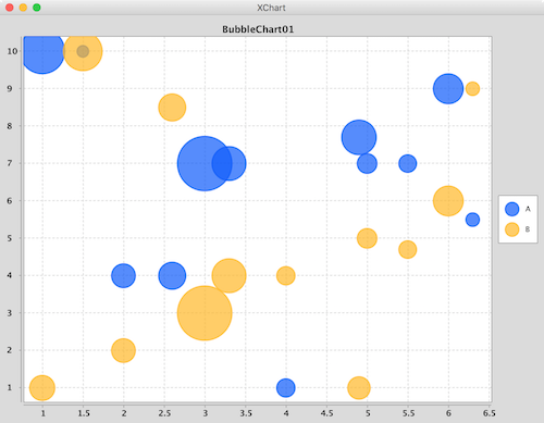
BubbleChart charts take Date or Number data types for the X-Axis and Number data types for the Y-Axis and bubble sizes.
Series render styles include: Round and in the near future Square.
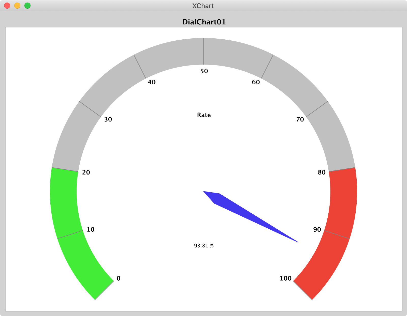
DialChart charts take a double to set the position of the dial pointer.
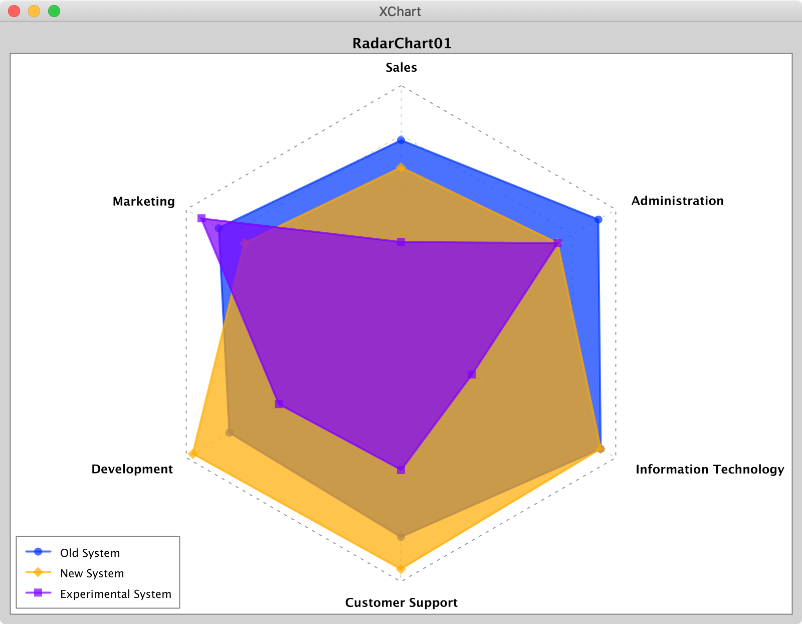
RadarChart charts take a double[] of values between 0 and 1 to set the position of radar node.
Series render styles include: Polygon and Circle.

OHLCChart charts take Date data types for the X-Axis and 4 Number data types for the Y-Axis. For both axes, the tick marks are auto generated to span the range and domain of the data in evenly-spaced intervals.
Series render styles include: Candle, HiLo.

BoxPlot charts take Date, Number or String data types for the X-Axis and Number data types for the Y-Axis. Each box chart is calculated from the corresponding series.
Create a BoxPlot via a BoxChartBuilder, style chart, add a series to it
// Create Chart
BoxChart chart = new BoxChartBuilder().title("box plot demo").xAxisTitle("Color").yAxisTitle("temperature").theme(ChartTheme.GGPlot2).build();
// Customize Chart
chart.getStyler().setShowWithinAreaPoint(true);
// Series
chart.addSeries("seriesName", Arrays.asList(40, -30, 20, 60, 50));
new SwingWrapper(chart).displayChart();
The BoxPlot calculation method is as follows:
1, If the calculation results are integers, the corresponding position is taken
For example, say the y value are y1 = 1, y2 = 2, y3 = 3. And n = 3;
The first quartile position should be q1 = (n + 1) /4
The second quartile position should be q2 = 2 * (n + 1) /4
The third quartile position should be q3 = 3 * (n + 1) /4
In this way we can calculate the positions:
q1 = (3 + 1) / 4 = 1
q2 = 2 * (3 + 1) / 4 = 2
q3 = 3 * (3 + 1) / 4 = 3
Q1 = yq1 = 1, Q2 = yq2 = 2, Q3 = yq3
Then the first quartile Q1 = 1, the second quartile Q2 = 2, and the third quartile Q3 = 3
2, If the calculation results are NOT integers, the positions should be calculated with the following formula
For another example, say the y value are y1 = 1, y2 = 2, y3 = 3, y4 = 4. And n = 4;
q1 = (n + 1) / 4 = (4 + 1) / 4 = 1.25
q2 = 2 * (n + 1) / 4 = 2 * (4 + 1) / 4 = 2.5
q3 = 3 * (n + 1) / 4 = 3 * (4 + 1) / 4 = 3.75
As we can see, the calculated values are NOT integers. In this case we shold calculate in the following way:
Q = y(int)q + (y(int)q + 1 - y(int)q) * (q % 1)
so
the first quartile: Q1 = y(int)q1 + (y(int)q1 + 1 - y(int)q1) * (q1 % 1) = 1 + (2 - 1) * 0.25 = 1.25
the second quartile: Q2 = y(int)q2 + (y(int)q2 + 1 - y(int)q2) * (q2 % 1) = 2 + (3 - 2) * 0.5 = 2.5
the third quartile: Q3 = y(int)q3 + (y(int)q3 + 1 - y(int)q3) * (q3 % 1) = 3 + (4 - 3) * 0.75 = 3.75
Upper limit = Q3 + 1.5 * IQR = Q3 + 1.5 * (Q3 - Q1) lower limit = Q3 - 1.5 * IQR = Q3 - 1.5 * (Q3 - Q1)
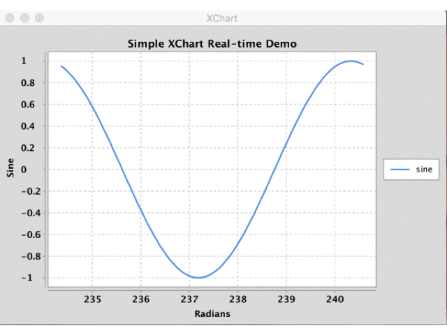
Creating real-time charts is as simple as calling updateXYSeries for one or more series objects through the XYChart instance and triggering a redraw of the JPanel containing the chart. This works for all chart types including XYChart, CategoryChart, BubbleChart and PieChart, for which example source code can be found here. Examples demonstrate using the SwingWrapper with repaintChart() method as well as XChartPanel with revalidate() and repaint().
The following sample code used to generate the above real-time chart can be found here.
public class SimpleRealTime {
public static void main(String[] args) throws Exception {
double phase = 0;
double[][] initdata = getSineData(phase);
// Create Chart
final XYChart chart = QuickChart.getChart("Simple XChart Real-time Demo", "Radians", "Sine", "sine", initdata[0], initdata[1]);
// Show it
final SwingWrapper<XYChart> sw = new SwingWrapper<XYChart>(chart);
sw.displayChart();
while (true) {
phase += 2 * Math.PI * 2 / 20.0;
Thread.sleep(100);
final double[][] data = getSineData(phase);
javax.swing.SwingUtilities.invokeLater(new Runnable() {
@Override
public void run() {
chart.updateXYSeries("sine", data[0], data[1], null);
sw.repaintChart();
}
});
}
}
private static double[][] getSineData(double phase) {
double[] xData = new double[100];
double[] yData = new double[100];
for (int i = 0; i < xData.length; i++) {
double radians = phase + (2 * Math.PI / xData.length * i);
xData[i] = radians;
yData[i] = Math.sin(radians);
}
return new double[][] { xData, yData };
}
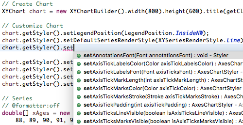
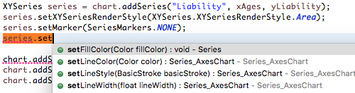
}All the styling options can be found in one of two possible places: 1) the Chart's Styler or 2) the series' set methods. With this chart customization design, all customization options can be quickly "discovered" using an IDE's built in "Content Assist". With centralized styling like this, there is no need to hunt around the entire charting API to find that one customization you're looking for - it's all right in one spot!
XChart automatically creates axis ticks and axis labels.
Default axis placement can be altered with chart.getStyler().setXAxisTickMarkSpacingHint(spacingHint);.
Default axis label patterns can be altered with one of:
chart.getStyler().setDatePattern(datePattern)chart.getStyler().setXAxisDecimalPattern(pattern);chart.getStyler().setYAxisDecimalPattern(pattern);
You can also create custom axis placements and axis labels. Create a map containing x -> label mappings:
- x : value where the tick will be drawn (this value is in xData space, not in pixel space).
- label: Tick label. If it is
null, tick will be generated with a" "label.
      Map<Object, Object> customXAxisTickLabelsMap = new HashMap<>();
      customXAxisTickLabelsMap.put(0, "zero");
      customXAxisTickLabelsMap.put(3, "3.5");
      customXAxisTickLabelsMap.put(5, " ");
      customXAxisTickLabelsMap.put(9, "nine");
      chart.setXAxisLabelOverrideMap(customXAxisTickLabelsMap);

      Map<Object, Object> customYAxisTickLabelsMap = new HashMap<>();
      customYAxisTickLabelsMap.put(1.0, "max c");
      customYAxisTickLabelsMap.put(6.0, "max b");
      customYAxisTickLabelsMap.put(9.0, "max a");
      chart.setYAxisLabelOverrideMap(customYAxisTickLabelsMap);
For category charts another way to create custom axis places is using category names in first series:
     Map<Object, Object> tickLabelOverrideMap = new HashMap<Object, Object>();

      Map<Object, Object> customTickLabelsMap = new HashMap<>();
      customTickLabelsMap.put("A", "-A-");
      customTickLabelsMap.put("D", "+D+");
      chart.setXAxisLabelOverrideMap(customTickLabelsMap);
Whenever you use setXAxisLabelOverrideMap the auto-generated tick labels will be replaced meaning none of the tick labels will be shown besides the ones provided by you in the override map.
XChart has multiple y axes feature. Y offset is calculated according to the y axis the series configured. Max y value in this axis is calculated according to the series on this axis only.
To set the y group:
series.setYAxisGroup(axisGroup); To manually change max/min of axis group:
((AxesChartStyler) chart.getStyler()).setYAxisMax(axisGroup, 200.0);Axis can be drawn on the left (default) or on the right of the chart:
chart.getStyler().setYAxisGroupPosition(axisGroup, Styler.YAxisPosition.Right);To set the Y axes titles:
    chart.setYAxisGroupTitle(0, "A");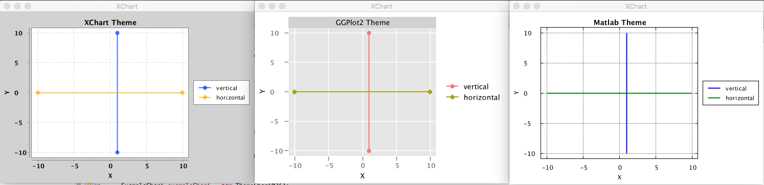
chart.setYAxisGroupTitle(1, "B");XChart ships with three different themes: Default XChart, GGPlot2 and Matlab. Using a different theme is as simple as setting the Chart's theme with the theme method of the ChartBuilder.
XYChart chart = new XYChartBuilder().width(800).height(600).theme(ChartTheme.Matlab).build();
Now go ahead and study some more examples, download the thing and provide feedback.
Download Jar: http://knowm.org/open-source/xchart/xchart-change-log
The XChart release artifacts are hosted on Maven Central.
Add the XChart library as a dependency to your pom.xml file:
    <dependency>
        <groupId>org.knowm.xchart</groupId>
        <artifactId>xchart</artifactId>
        <version>3.6.1</version>
    </dependency>
For snapshots, add the following to your pom.xml file:
    <repository>
      <id>sonatype-oss-snapshot</id>
      <snapshots/>
      <url>https://oss.sonatype.org/content/repositories/snapshots</url>
    </repository>

    <dependency>
      <groupId>org.knowm.xchart</groupId>
      <artifactId>xchart</artifactId>
      <version>3.6.2-SNAPSHOT</version>
    </dependency>
Snapshots can be manually downloaded from Sonatype: https://oss.sonatype.org/content/groups/public/org/knowm/xchart/xchart/
To use XChart with the Scala Build Tool (SBT) add the following to your build.sbt
libraryDependencies += "org.knowm.xchart" % "xchart" % "3.6.0" exclude("de.erichseifert.vectorgraphics2d", "VectorGraphics2D") withSources()mvn clean package
mvn javadoc:aggregate
mvn com.coveo:fmt-maven-plugin:format
Formats your code using google-java-format which follows Google's code styleguide.
If you want your IDE to stick to the same format, check out the available configuration plugins:
Download google-java-format-eclipse-plugin_*.jar and place in /Applications/Eclipse Java.app/Contents/Eclipse/dropins. Restart Eclipse. Select the plugin in Preferences > Java > Code Style > Formatter > Formatter Implementation.
In the plugins section in IntelliJ search for google-java-format and install the plugin. Restart IntelliJ.
cd /path/to/xchart-demo/jar/
java -cp xchart-demo-3.6.0.jar:xchart-3.6.0.jar org.knowm.xchart.demo.XChartDemo
Please report any bugs or submit feature requests to XChart's Github issue tracker.
